Customers typically turn to a company’s website first when seeking information about cosmetic surgery or finding an aesthetician clinic. In the swiftly growing field of plastic surgery, standing out from competitors is vital for success. Yet, as the market expands, competition intensifies, prompting doctors to seek an edge.
One effective strategy is to attract more clients by crafting websites with an attractive, contemporary design. For cosmetic surgeons, establishing a robust online presence is imperative for success. A well-crafted website is essential for making a favorable initial impression on potential patients. Given that most clients begin their research on Google, the website plays a pivotal role in their decision-making process.
This blog delves into the top 14 plastic surgery websites to aid you in creating an appealing online presence. Let’s dive in.
8 Tips for Designing the Perfect Website for Plastic Surgeons
1. Simple Navigation
For a plastic surgery website to ensure customers swiftly find the information they need, it must boast straightforward navigation. The primary navigation menu, housing essential categories like procedures, before/after photos, testimonials, pricing, and contact details, should be prominently displayed upfront. It’s vital to avoid overwhelming users with an excessive array of menu options.
2. Attractive Graphics
Visuals take center stage on a plastic surgery website. Patients expect tangible results. Plastic surgeons operate in a visually-driven domain, heavily relying on captivating graphics, before-and-after images, and visually striking hero shots to showcase their work. This leaves prospective patients with a lasting impression, highlighting the practice’s expertise and achievements.
3. Resources and Patient Education
Offer comprehensive and enlightening descriptions of the treatments available, elucidating the benefits, drawbacks, and anticipated outcomes. Ensure to cover details regarding the procedure itself, the recovery period, and any necessary prerequisites. Additionally, showcase before-and-after images of real patients to illustrate the transformative potential of the procedures.
4. Share Customer Reviews
Integrating customer reviews and testimonials into your plastic surgery website is vital for establishing trust and credibility. Showcasing positive feedback from satisfied patients in a streamlined manner helps potential clients feel assured in selecting your practice for their cosmetic requirements. Consider prominently featuring testimonials on your homepage or creating a dedicated section where visitors can effortlessly peruse others’ experiences.
5. Show What Makes You Special
Emphasizing what distinguishes your plastic surgery practice from competitors is crucial for attracting clients. Whether it’s your extensive experience, specialized expertise, innovative techniques, accolades, or dedication to patient care, effectively communicate your unique selling points across your website. Utilize compelling visuals like before-and-after photos or videos to exhibit the excellence of your work and illustrate why you’re the premier choice for prospective patients.
6. Keep Contacting you Easier
Facilitate seamless communication with your practice by offering multiple contact options on your website. Incorporate a prominent contact form, prominently display your phone number and email address, and contemplate integrating live chat support for instant assistance. Furthermore, ensure that your contact information is readily accessible from any page on the site, such as in the header or footer, enabling users to easily locate and reach out to you.
7. Mobile-Friendliness
A website lacking mobile responsiveness can lead to a poor user experience, as consumers may find it difficult to navigate and access content on their smartphones or tablets. This could result in a loss of potential patients, significant bounce rates, and businesses risk losing customers to competitors.
8. Privacy and Security Considerations
Ensuring privacy and security is paramount for plastic surgery websites, given their handling of sensitive personal and medical data such as medical histories, images, and contact details. Potential patients need assurance that their information will be safeguarded if they choose to become clients. Implementing security measures such as SSL certificates, secure forms, and encrypted data transmission is crucial for protecting patient information and thwarting unauthorized access or data breaches.
14 Best Plastic Surgery Website Designs
1. VIP Plastic Surgery

VIP Plastic Surgery’s website immediately captivates visitors with a breathtaking hero video that sets the tone for the entire experience. Carefully selected to showcase the clinic’s expertise and the transformative power of plastic surgery, the video evokes emotions and draws viewers deeper into the site.
Throughout the website, large, high-resolution photographs highlight the clinic’s stunning results and create a sense of aspiration for potential patients. Bold typography, strategically used for headlines and key messages, commands attention and reinforces the clinic’s commitment to excellence.
Consistency in design elements across the site, from the layout to the color scheme, ensures a cohesive and visually appealing experience for users. This meticulous attention to detail not only enhances the website’s marketing impact but also leaves a lasting impression on visitors, positioning VIP Plastic Surgery as a premier destination for aesthetic enhancement.
2. Shafer Clinic Fifth Avenue
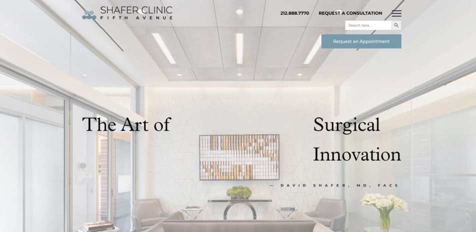
The Shafer Clinic’s plastic surgery website boasts sleek animations and a neatly organized layout. Its elegantly minimalist design engages visitors with a scrolling call-to-action and subtle motion effects.
Featuring a range of procedures, patient testimonials, and social proof, their website effectively showcases previous patients while outlining the services offered. Shafer Plastic Surgery has earned an impressive A grade on GTmetrix, with scores of 99% for Performance and 85% for Structure.
Their objective is to break down the traditional barrier between doctor and patient, fostering a calm and comfortable environment for patients. The website’s design successfully highlights the clinic’s experience and stellar reputation.
Convenient navigation in the top right corner allows visitors to access essential sections such as About Us, Testimonials, Services, News & Videos, and Special Offers.
3. DC Plastic Surgery Boutique

DC Plastic Surgery Boutique has chosen to center their business around women, recognizing them as their primary clientele. They’ve crafted a gentle feminine vibe using a beautiful combination of pink, white, and gold colors.
Upon visiting the slideshow, visitors are greeted with images portraying the clinic’s idealized, toned skin. As they scroll down the page, they encounter service sections focusing on various procedures and body parts. Honors and associations are displayed beneath a contact form at the bottom of the page, framed by a stunning photo of the Washington, DC, region.
Every aspect of the site’s design aims to evoke images of youthful vitality, elegance, and beauty, stimulating the visitor’s imagination. The gallery allows the physician to showcase their work and the results achieved for their patients.
4. Dream Medical Group by Dr. Kenneath Kim
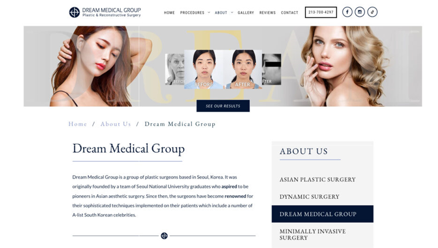
Dr. Kenneth Kim, a renowned plastic surgeon based in Los Angeles, specializes in nose and eye surgeries. His website exudes professionalism with a crisp black-and-white color scheme and outstanding graphics.
The homepage showcases three slideshow photographs of stunning women, complemented by creatively designed before-and-after surgical photos featuring elegant moving image effects.
Dr. Kim’s bio is presented in an eye-catching manner, highlighting his achievement of receiving the American Best Plastic Surgeon award three times consecutively. This instills the necessary authenticity and builds trust among users, a crucial factor for plastic surgery websites in today’s digital landscape.
Furthermore, the website features an accessibility menu powered by UserWay, ensuring inclusivity for all visitors. Interested individuals can also listen to the embedded podcast featuring Dr. Kim, enhancing the credibility of his services and expertise for potential customers.
5. Rapaport Plastic Surgery Website
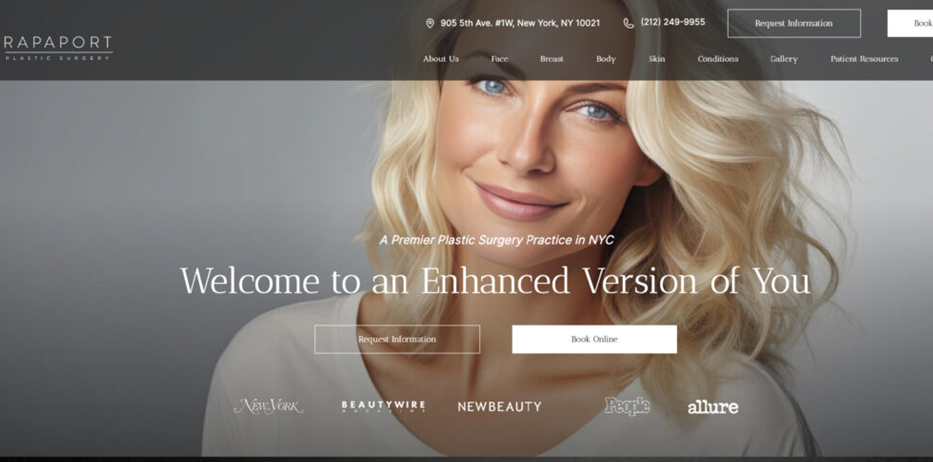
Rapaport Plastic Surgery’s website sets a benchmark in both visual appeal and user-friendliness. The striking color scheme immediately captivates visitors, setting the stage for a memorable browsing experience.
The carefully selected hues not only align with the clinic’s brand identity but also convey sophistication and trustworthiness. Navigation on the site is seamless, featuring intuitive menus and clear pathways that effortlessly guide users to their desired destinations.
A standout feature is the categorization of services into three distinct sections, streamlining the search process for visitors and ensuring swift access to relevant information.
Moreover, Rapaport Plastic Surgery effectively utilizes social proof by prominently featuring prestigious magazines that have showcased the clinic. This immediate display of credibility and recognition fosters trust with potential patients, affirming the clinic’s expertise and esteemed reputation within the industry.
6. The Oaks Plastic Surgery
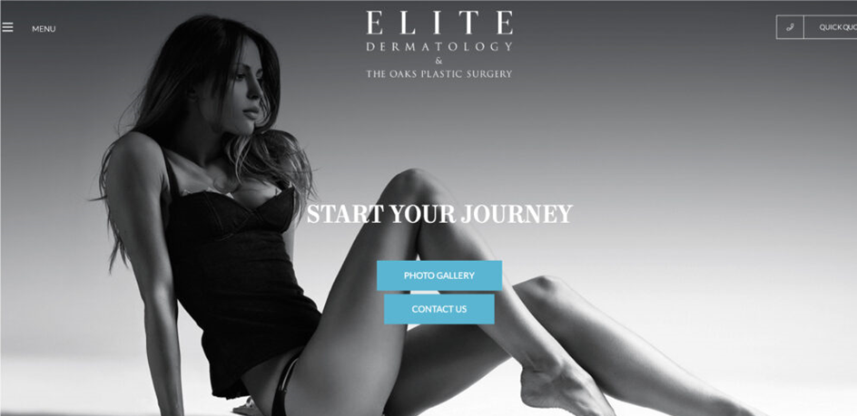
The Oaks Plastic Surgery website stands out as one of the premier plastic surgery websites on our list. Its elegant color palette, featuring black, white, grey, and blue tones, swiftly establishes an inviting environment for users.
The top image of the website offers a glimpse into the services provided by the practice, accompanied by the effective call-to-action slogan, “START YOUR JOURNEY.” This prompts users to delve deeper into the site by scrolling down for more details.
The company’s services and contact information are easily accessible to users, thanks to the hamburger menu located in the upper-left corner. This streamlined navigation makes it effortless for users to explore the website and reach out to the company to schedule a consultation or appointment.
7. Premier Medical Aesthetics
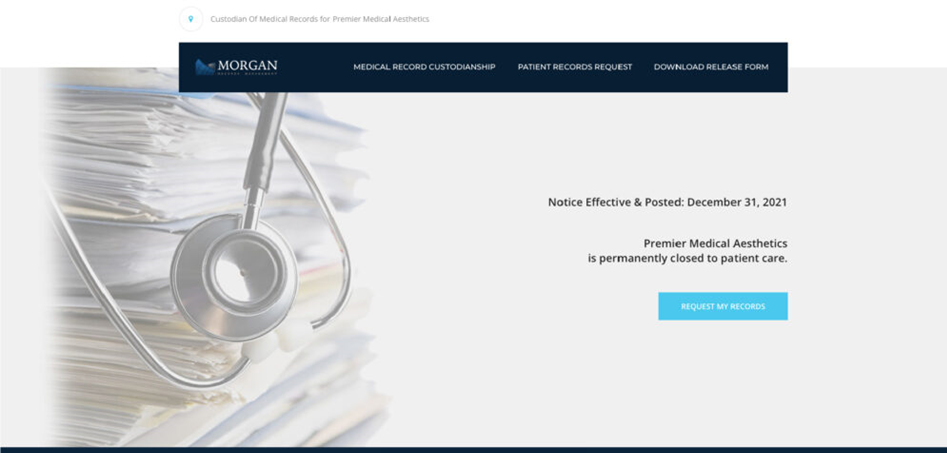
This website boasts a modern design characterized by a sleek, professional appearance in black, blue, and white. Upon arrival, guests are greeted with a video offering insight into the practice and providing a firsthand experience of visiting their plastic surgeon.
A prominent blue action appointment button, featuring basic yet appealing customized branding, serves as the focal point. As users navigate the site, captivating photography directs them to additional resources, while eye-catching blue buttons prompt action.
At the bottom of the page, contact information and a form are presented over a serene photo, creating a cohesive visual experience. A scrolling testimonial section showcases other patients’ experiences in large, easy-to-read text, maximizing space with a slideshow of reviews.
The navigation visuals allow patients to envision themselves with the results of various procedures while also educating them on potential solutions for their concerns.
8. Rowe Aesthetics
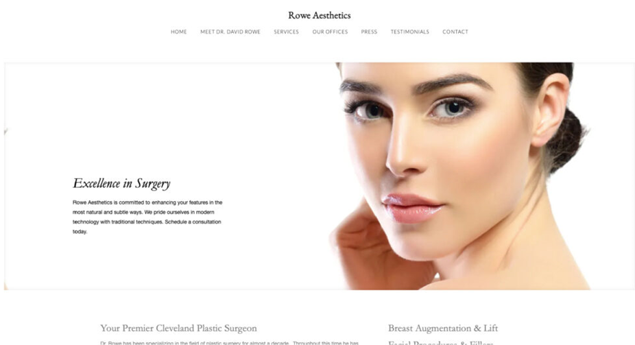
Rowe Aesthetics’ website design is both beautiful and straightforward, maintaining a clear plastic surgery theme. They prioritize simplicity by avoiding unnecessary or irrelevant content, ensuring a clutter-free browsing experience.
Navigation is made easy for customers, with a simple layout and minimal link density. Instead of experimenting with colors, they utilize white to accentuate text and photographs, creating a clean and inviting aesthetic.
Rowe Aesthetics’ website is incredibly user-friendly, featuring a menu for accessibility and an online booking system for appointments. The emphasis is placed on the featured image, drawing attention to it subtly and effectively. Overall, the website’s simplicity allows users to focus on key components without distractions.
9. Visage Facial Plastic Surgery

Visage Facial Surgery boasts a luxurious design highlighted by shiny gold and black elements, placing it firmly in the premium category. Its homepage is segmented into attention-grabbing sections, featuring high-quality photography.
The website’s navigation is seamless, allowing customers to access every section effortlessly without scrolling across the homepage. Visage Facial Surgery utilizes top-notch photography and video content to effectively convey their message, showcasing their facility and client testimonials.
With a clear and compelling call to action, the clinic advocates for natural, long-lasting rejuvenation, specializing in procedures for the face and neck. The website features a chatbot and an accessibility menu, directing users to pages such as About, Testimonials, Gallery, and FAQs, offering a comprehensive overview of their services and offerings.
10. Sieber Plastic Surgery Website Design
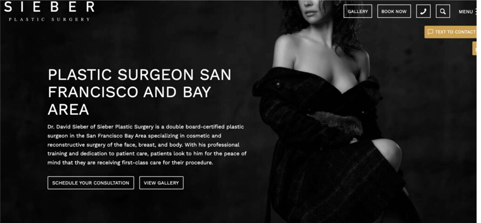
Sieber Plastic Surgery stands out as another remarkable example of a well-designed plastic surgery website. Its efficient use of space, highlighting images, subtitles, and links, complements its clean web design. A button for booking a virtual consultation enhances accessibility and contributes to a seamless user experience.
The website features a muted color palette with accents of gold, creating a sophisticated aesthetic. The hero section comprises simple elements and prominent buttons for booking a consultation, viewing a gallery, and contacting the clinic. Users are also provided with a chatbot and an accessibility plugin for added convenience.
With impressive GTmetrix scores of 91% for Performance and 95% for Structure, Sieber Plastic Surgery earns an overall grade of A, reflecting its commitment to excellence in both design and functionality.
11. Liu Plastic Surgery
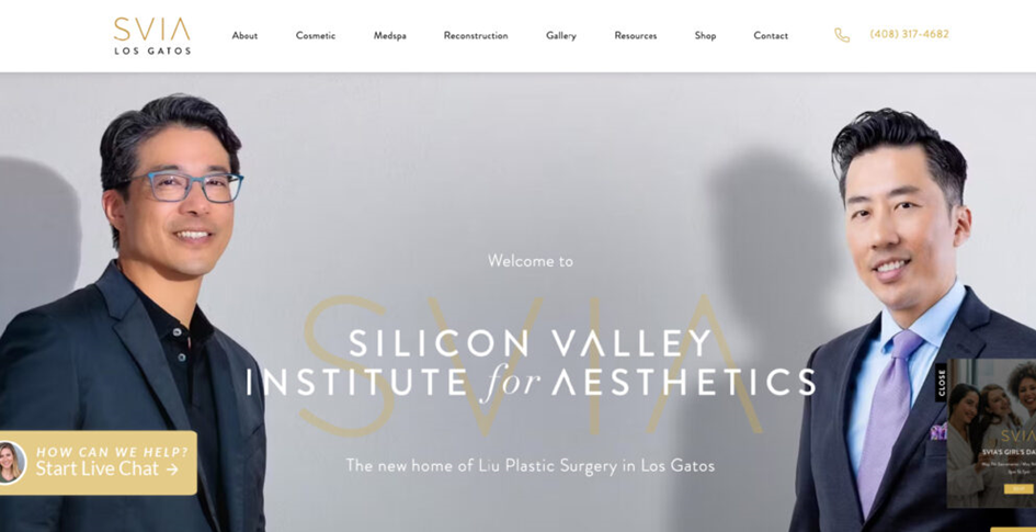
Liu Plastic Surgery’s website stands out for its modern and sleek design, featuring a sophisticated layout, contemporary typography, and striking imagery. The meticulous attention to detail in the design elements creates a visually appealing and cohesive user experience.
Each page is carefully organized, with clear navigation menus that facilitate easy access to information for visitors. High-quality images effectively showcase the clinic’s procedure results, instilling confidence in potential clients.
Strategically placed call-to-action buttons guide users towards important actions, such as scheduling consultations or learning more about specific procedures, thereby enhancing the site’s effectiveness in driving conversions.
With its seamless blend of aesthetics and functionality, Liu Plastic Surgery’s website serves as a powerful marketing tool while also establishing trust and credibility in the competitive landscape of cosmetic surgery.
12. The Beverly Hills Institute
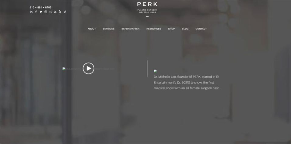
A cosmetic and reconstructive surgery facility in Beverly Hills caters to high-class clientele, reflected in every aspect of its website design. The goal is to convey a refined, elegant feel that resonates with the target audience.
The slideshow showcases outcomes that prospective patients might envision for themselves, using high-end imagery to capture their imagination. Information regarding procedures is accompanied by magnificent backdrop imagery, enhancing the presentation.
Stunning photographs from satisfied patients demonstrate before-and-after results, while testimonials are presented on a visually appealing blue gradient background, emphasizing positive outcomes from previous patients.
Returning patients can swiftly access the information they need by clicking on prominently displayed contact details at the top of the screen. Additionally, the website includes comprehensive credentials and awards for all surgeons, further enhancing its credibility and trustworthiness.
13. Ela Plastic Surgery’s website design
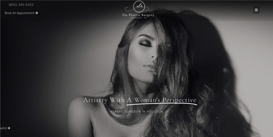
Ela Plastic Surgery’s website features a visually appealing darker color scheme that complements its services and appeals to internet users who prefer darker interfaces. The design keeps the homepage simple and uncomplicated, providing users with access to all the necessary information.
Visitors can easily navigate to information about the practice’s services, view a gallery showcasing transformative results, explore a blog section, and learn more about their locations using the hamburger menu located in the upper right corner of the website.
Overall, Ela Plastic Surgery has effectively provided users with the information they need while building trust through images from previous customers. The website is modern and sophisticated, showcasing everything users require from a plastic surgery website.
14. Bellevue Aesthetic
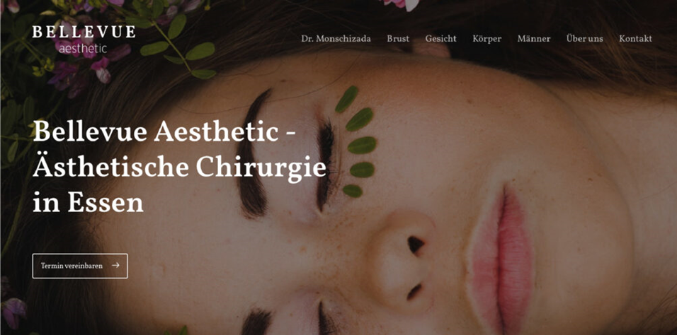
Bellevue Aesthetic, a prominent cosmetic surgery clinic based in Germany, sets itself apart with its bilingual website, catering to both German and English-speaking audiences. The default language of the site is German, with an intuitive option for visitors to switch to English.
The warm earth tones chosen for the website’s color palette contribute to a positive user experience, fostering engagement and retention. One standout feature of Bellevue Aesthetic’s website is its appointment booking functionality, allowing visitors to conveniently schedule appointments online.
Dr. Monschizada’s cohesive integration of warm earth tones, bilingual capabilities, and online booking functionality creates a unified and harmonious digital platform that embodies the clinic’s values of professionalism, accessibility, and patient-centered care.
End Note
Whether you’re at the outset of your website journey or amidst a comprehensive redesign, these 14 plastic surgery website designs offer invaluable inspiration for your project. We trust this post has aided you in selecting the perfect website for your plastic surgery business, poised to attract new customers and promote your brand with its sleek style and practical features.
Crafting an immersive experience that resonates with your audience is paramount, just as crucial as selecting a visually appealing design. Each example above demonstrates an effective execution of key web design principles while maintaining a unique identity of its own.
If you’re eager to embark on a website redesign for a superior user experience, don’t hesitate to reach out to our web design experts. We’re just a call away! Our team comprehends the intricacies of modern aesthetics and can create strategic plastic surgery website designs that captivate visitors and yield optimal results.
FAQs
- Why Do Plastic Surgeons Need Websites?
Plastic surgery websites serve multiple purposes, including facilitating easy appointment booking and showcasing surgeons’ work. They are essential for establishing credibility and trust with potential patients, as well as enhancing search engine visibility to attract more business.
- Can SEO Strategies Increase the Visibility of My Plastic Surgery Website?
Absolutely! Implementing a range of SEO techniques, including relevant keywords and semantic variations, is crucial. A comprehensive SEO strategy boosts your website’s ranking in search results, attracting more potential customers and highlighting success stories. However, it’s important to complement SEO with other visibility-boosting strategies.
- What’s the Best Content Strategy for a Plastic Surgery Website?
The key is to provide informative yet consumer-friendly content. Break down complex surgical procedures into easily understandable segments. Additionally, supplement your blog with content covering post-operative care, lifestyle tips, and industry advancements to establish authority and support SEO efforts.
- How Can I Create a Website Design That Stands Out from Competitors?
To differentiate yourself, focus on creating a visually appealing website with intuitive navigation and convenient features such as online booking. Showcase your expertise through testimonials, before-and-after photos, and social proof, while providing valuable educational content to build credibility and attract potential patients.
